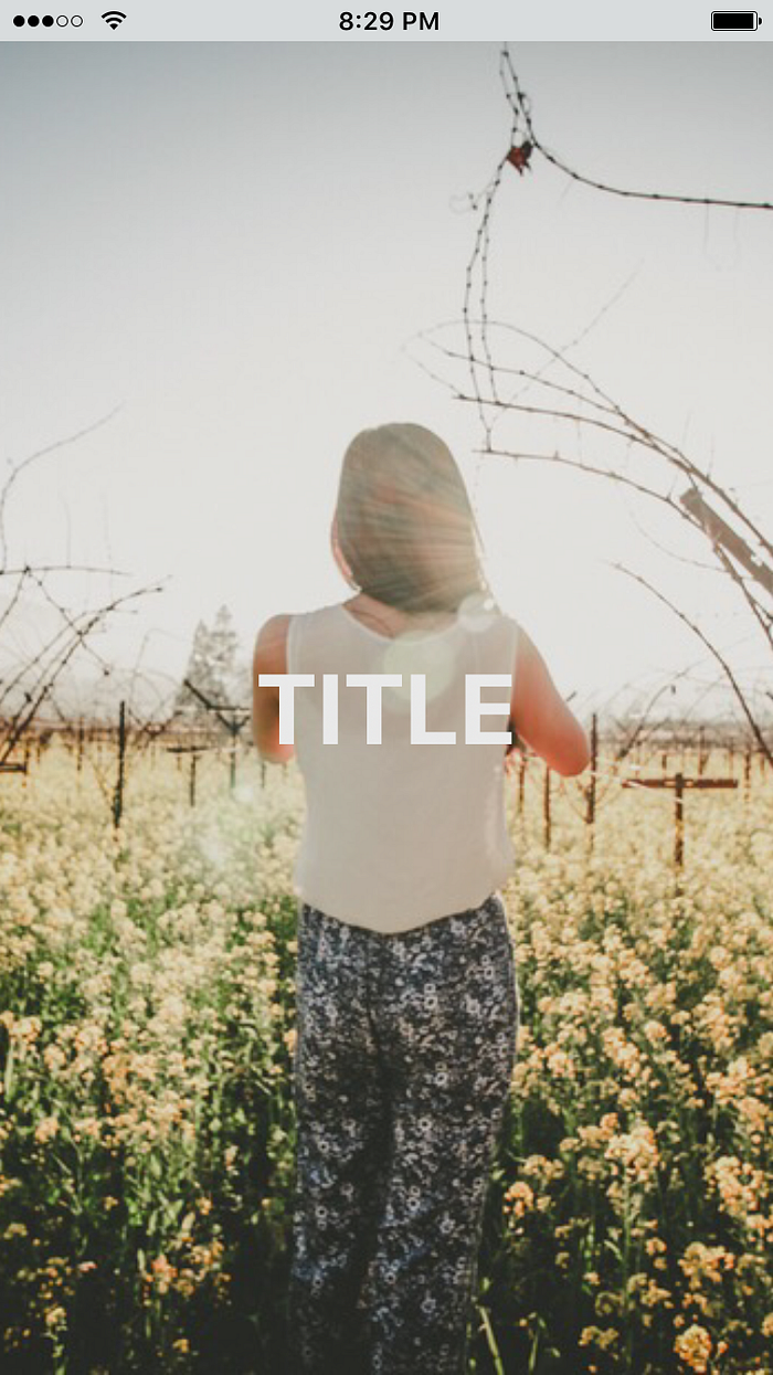
Vertically centering text over images in react native with flexbox
Vertical and horizontal centering is one of those things that always comes up in design, and luckily in the past couple of years we’ve started to get better solves for it.
In web, a common practice for me was to use absolute positioning on the text, with a
left: 50%, top: 50%, transform: translate(-50%,-50%)style to get it to center over the image.
Unless you’re using one of the recent versions of react native, however, you don’t have access to percentages, and chances are you’re using flexbox as a default for layout. Here’s a simple alternative:
<View
  style={styles.container}
>
  <Image
    source={{uri: 'https://images.unsplash.com/photo-1424819827928-55f0c8497861?fit=crop&w=600&h=600'}}
    style={styles.image}
  >
      <Text
        style={styles.paragraph}
      >
        TITLE
      </Text>
  </Image>
</View >
    );
  }
}const styles = StyleSheet.create({
  container: {
    flex: 1,
    alignItems: 'stretch',
    justifyContent: 'center',
  },
  image: {
    flexGrow:1,
    height:null,
    width:null,
    alignItems: 'center',
    justifyContent:'center',
  },
  paragraph: {
    textAlign: 'center',
  },
});
In React Native, an image component can encapsulate a text component, so there’s no need to establish a z index. If you don’t want to have to worry about the dimensions of your image, you can specify flexGrow, so that it fills its container, and null out the height and width, so that the encapsulated text component can align properly to the center.
If you’d like to see a live example, check out the super useful new Sketch playground utility from Exponent. It’s like CodePen for React Native and makes it super easy to test simple sketches out on device.

